As we embark on this colourful journey, let's take a moment to understand the profound effects of the colour red on our minds and behaviours. Red, a colour commonly associated with love, danger, power, and passion, is one of the most powerful tools in the colour psychology toolbox. It's the colour that causes our hearts to race with excitement or fear, a colour that can stop us in our tracks or motivate us to action.
Ever noticed how red is used in clearance sales or stop signs? That's no mere design choice. It's a calculated use of colour psychology. Red evokes a sense of urgency and grabs our attention like no other colour. It's the universal signal for 'stop' or 'beware' - it sparks alertness and commands attention, which is why we see it used so frequently in warning signs and emergency signals.
But there's a flip side to the coin. Red is also the colour of passion and love, symbolizing warmth and comfort. It's the colour of the beating heart, of roses and Valentine’s Day. It's the colour that kindles our emotions and stirs our passions.
As we delve deeper into the psychology of the colour red, you'll discover its dynamic and complex nature. It's not just a colour. It's a powerful psychological tool that, when used effectively, can influence our perceptions and actions in subtle, yet significant ways. So, let's continue this journey together, exploring the fascinating world of the colour red and its impact on our lives.
Red in Politics: Symbolism and Propaganda

Throughout history, the color red has remained intertwined with the realms of politics and revolution. Its symbolic significance, representing strength, power, and revolutionary change, has resonated across different cultures and eras. From the iconic red flags of the French Revolution to the scarlet banners of Communist regimes, red has consistently been at the forefront of political symbolism, demanding attention and igniting passion. Explore the intriguing world of politics and revolution, where the color red reigns supreme.
Even in the modern era, the influence of red endures. Political parties across the globe strategically incorporate red into their logos and campaign materials, harnessing its power to project authority and evoke emotional responses among the masses. The striking visual impact of red, coupled with its historical associations, continues to shape our collective psyche and influence the course of political discourse.
The enduring presence of red as a political symbol is a testament to its potency and its ability to captivate the imagination. Not only does it command attention, but it also elicits a wide range of emotions - from determination and empowerment to controversy and dissent. By embodying the essence of political movements and revolutions, red leaves an indelible mark on the fabric of our society, reminding us of the transformative power that lies within the realm of politics.
Red in Our Everyday Lives: Physical User Interfaces
As you navigate through your daily routine, have you ever taken a moment to contemplate the significance of the traffic lights at a busy intersection or the warning labels on hazardous substances? The colour red consistently demands our attention in the physical landscape, serving as a symbol of caution and prompting us to stop or exercise care.
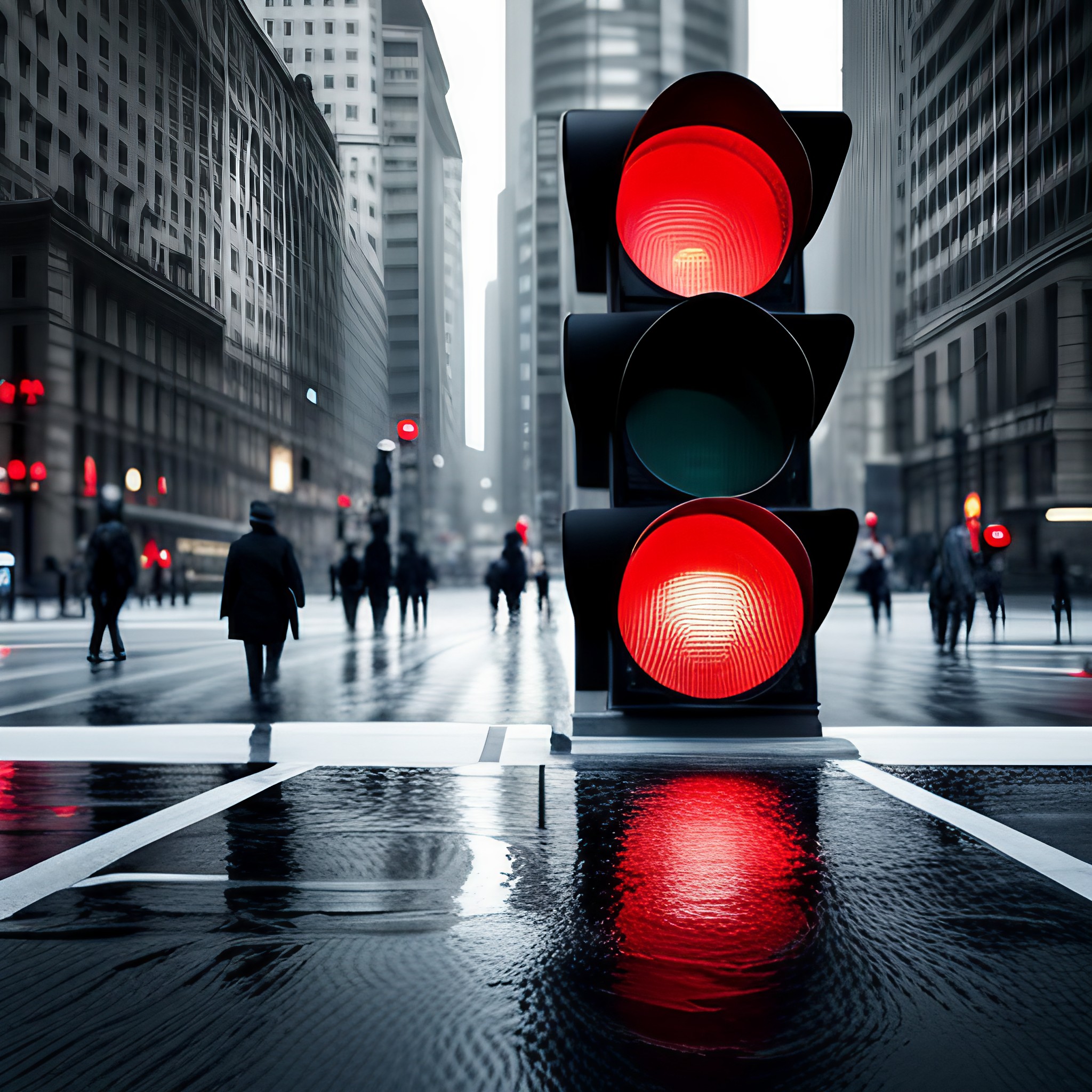
The use of red in physical interfaces is not arbitrary; it holds profound meaning. This vibrant hue universally signifies the need to halt or avoid danger, playing a pivotal role in shaping our behaviours and decisions. It is no coincidence that stop signs and traffic lights worldwide predominantly feature red. This bold colour cuts through the visual noise of our surroundings, demanding immediate attention and swift response.
In the realm of signage and safety warnings, the colour red serves as an intuitive cue, compelling us to stop or proceed cautiously. Its arresting visibility, coupled with its psychological association with danger, ensures that we instinctively comprehend its message without requiring linguistic understanding. From fire extinguisher labels to hazard signs, red's high visibility guarantees that safety messages are impossible to overlook.
Far beyond being a mere colour, red is a universal language that communicates volumes about urgency, danger, and prohibition. It exerts a significant influence on our daily interactions and behaviours, shaping the way we perceive and respond to our surroundings.
Red in Digital User Interfaces
The Crucial Role of Red in UI/UX Design Principles
As an experienced graphic and web designer, I have come to recognize the immense power that the color red holds in the realm of UI/UX design principles. This vibrant hue is impossible to overlook, capturing immediate attention and becoming a go-to choice for emphasizing critical user interface elements, from error notifications to important buttons and persuasive calls-to-action.
Consider the 'Delete' button on your smartphone's camera roll. Commonly rendered in a shade of red, this button signifies the permanent deletion of photos. When you're about to remove memories captured in pixels, red is the last colour you see before you confirm your decision. The use of red here is intentional - it's a universal signal of caution. It implicitly advises us to think twice before we proceed, as the action we're about to undertake is irreversible, with no chance of an 'undo'. This striking use of red in user interface design serves as a powerful reminder of the serious consequences that certain actions can hold.
That's the effectual use of red – it serves as a visual deterrent, exploiting our intrinsic fear of risk and danger. In the digital design landscape, red is frequently used as a visual signal to highlight potential problems or denote areas that need user attention. Essentially, it plays the role of a digital stop sign, prompting users to halt and reconsider their next move.
However, integrating red into UI/UX design is a task that demands careful thought. An excess of this powerful color can cause visual fatigue and can be so overpowering that it becomes counterproductive. We, as designers, must find a fine balance, employing red to guide and warn users, but ensuring it does not alarm or dominate.
The fundamental message here is that red is not merely a color option in UI/UX design—it's a strategic instrument that can dramatically influence user engagement, navigation, and reaction. As you explore the digital universe, I urge you to notice how red is used to direct, alert, and engage you. You may be taken aback by how profoundly this dynamic color molds your digital experience.
By understanding the influential role of red in UI/UX design principles, we can optimize user interface design, create effective visual cues, and ultimately enhance user engagement and satisfaction. This knowledge allows us to create more intuitive, user-friendly designs that not only look good but also function effectively, thereby improving the overall user experience.
Painting the Town Red: The Role of Red in Brand Identity
Red is not merely a colour; it is a powerful tool that has been utilised time and again in branding and marketing strategies. It is a colour that effortlessly attracts attention and aids recall. Ever noticed the red hue in the logos of certain globally recognised brands? The use of red is deliberate and strategic, aiming to convey a brand's core values while also captivating consumers' attention.

Well Known Brands Sporting Red
A multitude of renowned brands have harnessed the power of red in their logos. Coca-Cola, Netflix, and Kellogg's, to name a few, all sport the fiery hue in their brand identity. Each of these brands has masterfully used this shade to their advantage, helping consumers instantaneously identify and connect with their products.
The Psychology Behind Red in Branding
So, why have these brands chosen red? The psychology of colour tells us that red is associated with energy, passion, and action. It is a colour that promotes urgency and encourages consumers to make impulsive buying decisions. It's no coincidence that sales signs and clearance items are often marked in red.
Can You Imagine a World Without Red Logos?
Picture this: the Coca-Cola logo in a cool blue or the Netflix logo in a calm green. It doesn't quite have the same impact, does it? That's because these brands have successfully ingrained their identities in our minds using their distinctive red logos. The psychological associations and the visibility of red contribute to a powerful brand image that resonates with us.
Red - a colour of impact, a symbol of power, and an instrument of influence. It's fascinating to see how something as simple as a colour can hold so much significance in the business world. So next time you see a red logo, know that there's much more to it than meets the eye. It's a calculated, strategic move to make an indelible mark on your memory, compelling you to remember and engage with the brand. In the realm of corporate branding, the power of red simply cannot be underestimated.
By understanding the role of red in brand identity, businesses can utilise this knowledge to their advantage, creating a compelling and memorable brand image. As consumers, we become more informed, able to recognise and appreciate the subtle strategies employed by brands that shape our perceptions and influence our buying decisions.
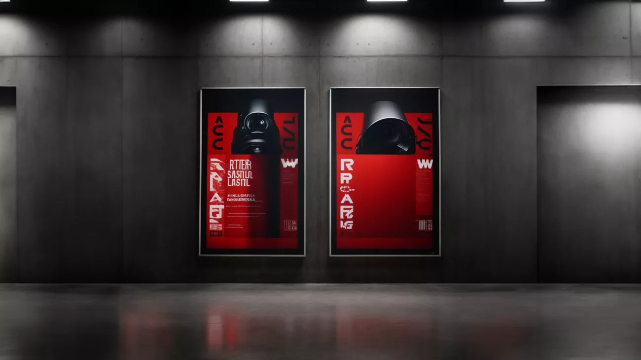
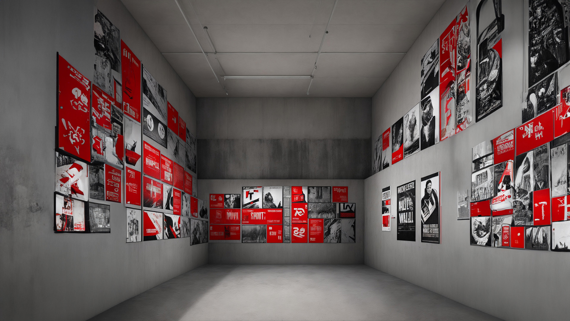
The Artist's Palette: Red in Graphic Design and Advertising Messages
Red's potency extends beyond the realms of user interface and brand identity and permeates the sphere of graphic design and advertising. This vibrant hue, when used strategically, can turn an ordinary design into a visual masterpiece and a mundane ad into a captivating message.

A New Lens on Graphic Design and Advertising
Consider any impactful advertisement you've recently seen or a graphic design that has left a lasting impression. Chances are, the judicious use of red might have been part of its success. Red's inherent ability to draw attention makes it an invaluable asset in an artist's palette, transforming the aesthetics and significantly enhancing the overall message.
Effective Use of Red in Designs and Advertising
Red can be employed effectively to highlight key elements in a design or to make an advertising message stand out. However, like any other potent tool, it needs to be used judiciously. In design, red can serve as a brilliant contrast or act as a powerful background. In advertising, a splash of red can dramatically enhance visibility and recall value.

The allure of red extends to its ability to seduce, add dynamism and indicate power. Red, being the colour of love and passion, irresistibly draws in the viewer, creating a feeling of desire and attraction. At the same time, its intensity imbues a design or advertisement message with dynamism, making it feel alive and exciting. It is this vibrancy that makes red so impactful, invoking a sense of urgency and prompting action. Furthermore, red is universally recognised as a symbol of power. It communicates strength and dominance, instantly captivating attention and commanding respect.
The strategic use of red in design and advertising can, therefore, create a potent visual impact that resonates with the audience on a deeper, psychological level.
Conclusion
In this exploration, we've delved into the fascinating world of colour psychology, focusing particularly on the power of red. We've seen how it plays a strong role in branding, with many renowned brands leveraging its psychological associations to create compelling identities. We've also discussed how red can be effectively used in graphic design and advertising to make a visually striking impact, attract attention, and elicit specific emotional responses. In our everyday life, red's presence is ubiquitous and significant, whether it's on a package, billboard, or a logo. So, the next time you see a red sign or logo, you'll know exactly why it caught your eye and appreciate the strategic thought put into its creation.
Red's potent influence on our lives is undeniably fascinating and knowing about it helps us understand and decode the world around us in a more meaningful way.
