As a seasoned graphic designer, I've seen first-hand how blending modes can truly transform a design, infusing it with depth, dimension, and intrigue. Today, I'm excited to share with you my knowledge and experience with these potent tools.
Understanding Blending Modes
Blending modes are like the secret sauce in the graphic design world. They allow you to manipulate how colours interact, creating effects that enhance the depth, dimension, and overall visual appeal of your designs. Trust me, any web designer worth their salt knows the value of mastering blending modes.
In this blog post, I'll be providing visual examples to further illustrate the power of blend modes between layers in Photoshop. I've selected an image with a good range of contrast and varying colour tones to help highlight the effects. Over this, I've added an overlay layer featuring a blue gradient. This setup will allow us to delve into how the blend modes interact with the photo underneath in different ways. So, let's embark on this exploration together as we peel back the layers of Photoshop's blend modes and see just how they can transform your design work in remarkable ways.
Blending Modes for Social Media Content
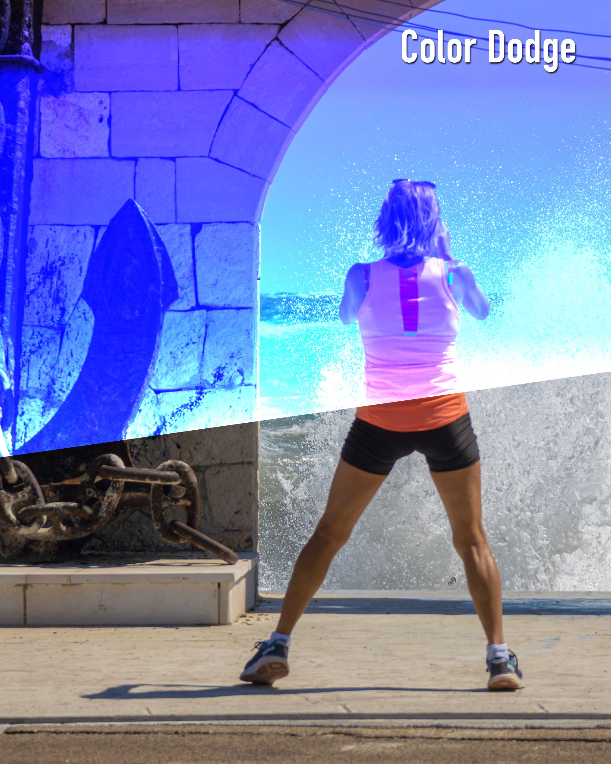
If you're actively creating content for platforms like Instagram and TikTok, blending modes are your best friends. For instance, the Color Dodge mode can create stunning, vibrant results that will make your posts stand out. And remember, experimenting is key. The more you play with different modes, the better you become.
Blend Modes: The Magic Behind Social Media Filters
You know those incredible filters you use on Instagram to make your selfies look just right? Well, the magic behind them lies largely in blending modes. Instagram, and many other social media applications, use these dynamic tools to transform your photos with just a swipe. Just as we discussed earlier with Color Dodge, a filter might apply a blending mode to give your image a warm, vintage hint, or perhaps a cool, dramatic contrast.
As content creators, understanding the mechanics behind the filters we so love can give us the edge we need to truly personalize our content and stand out from the crowd. So next time you swipe through your filters, remember the power of blending modes and consider how you might use them in your own unique way.
Linear Dodge (Add): A Vibrant Tool
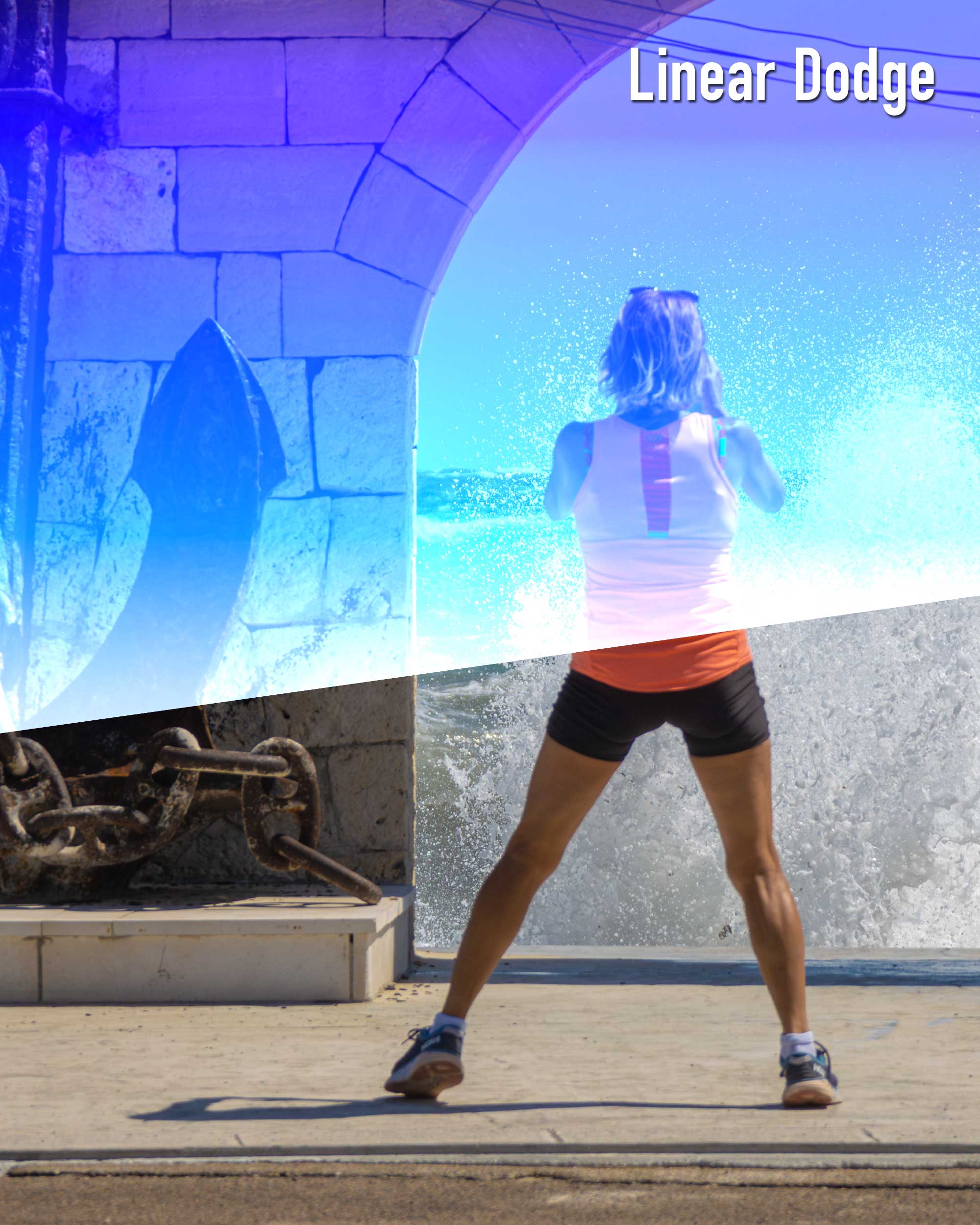
Let's talk about Linear Dodge (Add), a technique that has drastically improved my designs. This technique blends colours and brightness to create a vibrant effect. However, remember, blending with black won't change anything. But trust me when I say, Linear Dodge (Add) can take your designs from good to great.
Lighten vs Lighter Color: Knowing the Difference
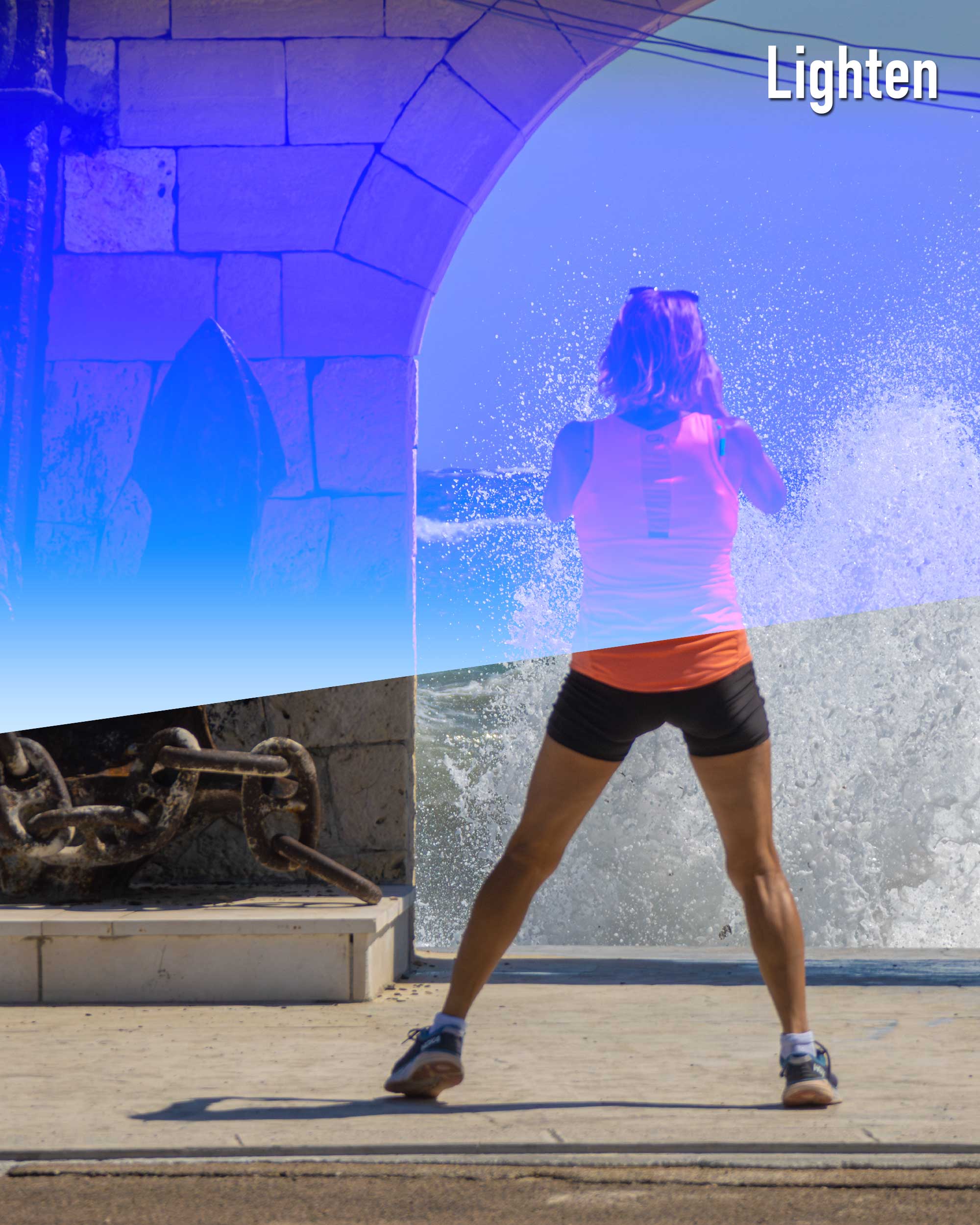
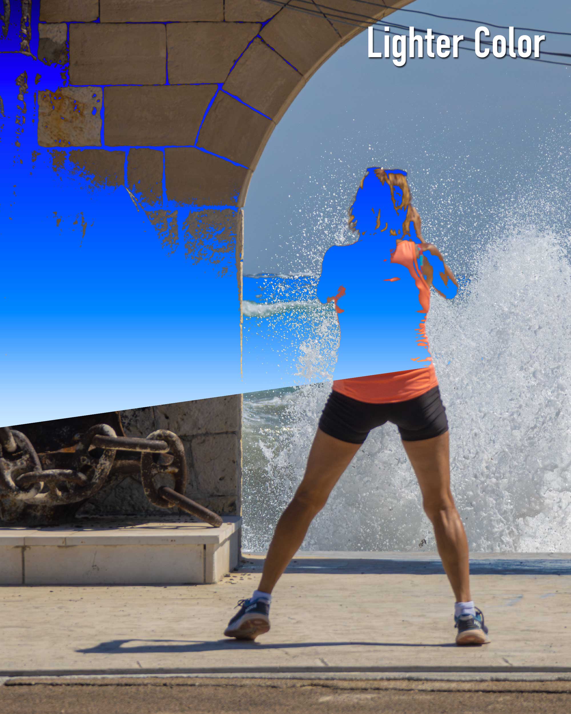
Understanding the difference between Lighten and Lighter Color is crucial. While Lighter Color creates a composite image using all three RGB channels, Lighten blends each channel individually. Think of it as baking a cake. Lighten is like measuring each ingredient separately and blending them together, while Lighter Color is like throwing everything in the bowl at once. Knowing the difference between these two can help you achieve the exact look that you're aiming for.
Powering Your Content with the Contrast Group and Overlay
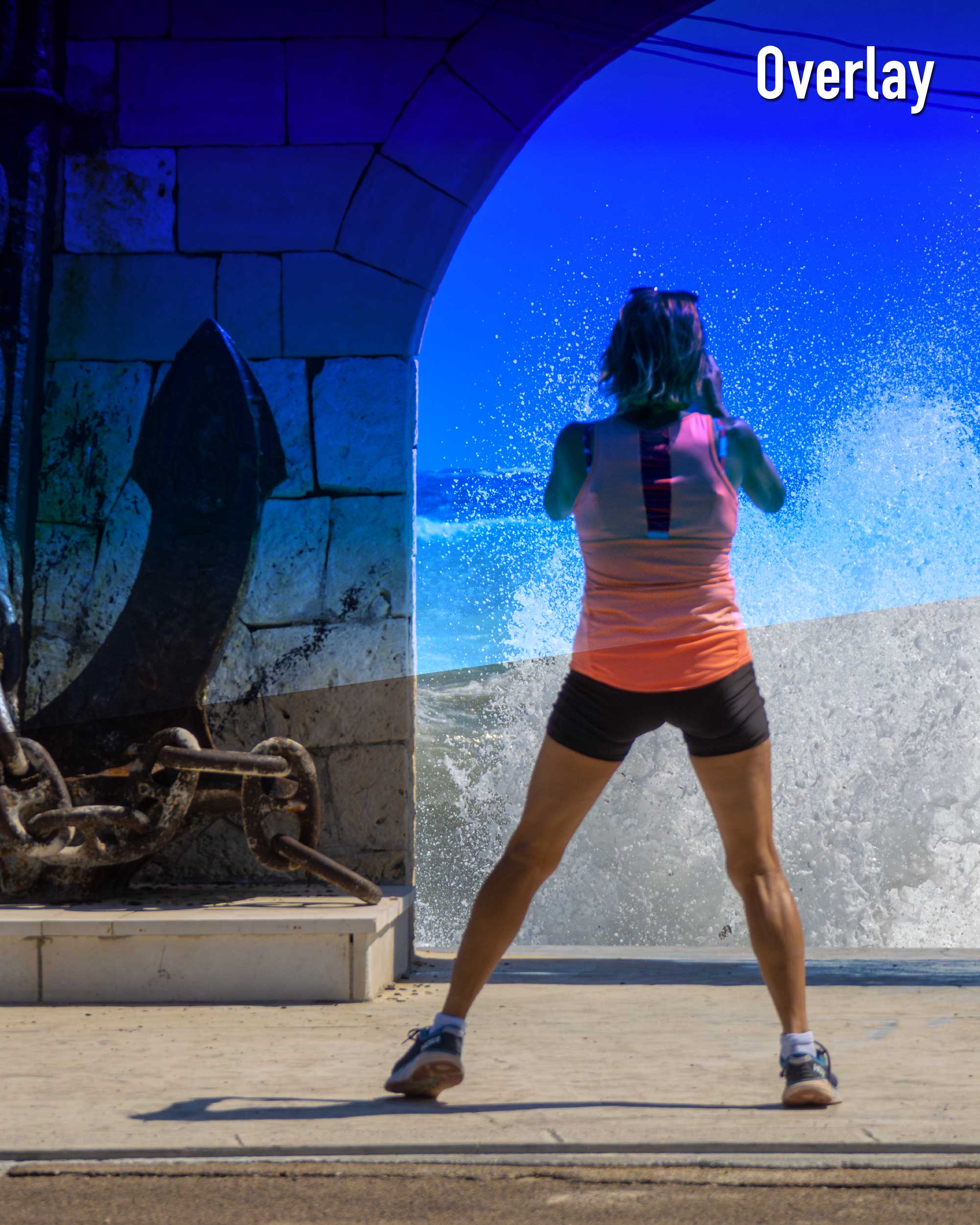
Now, let me introduce you to the Contrast group of Blending Modes and Overlay. These blending modes create unique effects that are perfect for social media content. Using these modes, I've seen my content pop and shine like never before. So, I encourage you to give them a try.
Using Soft Light and Hard Light for Social Media
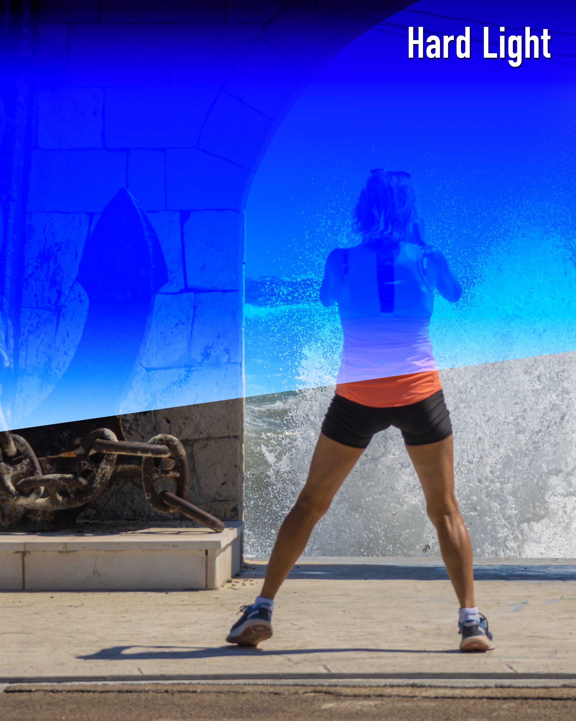
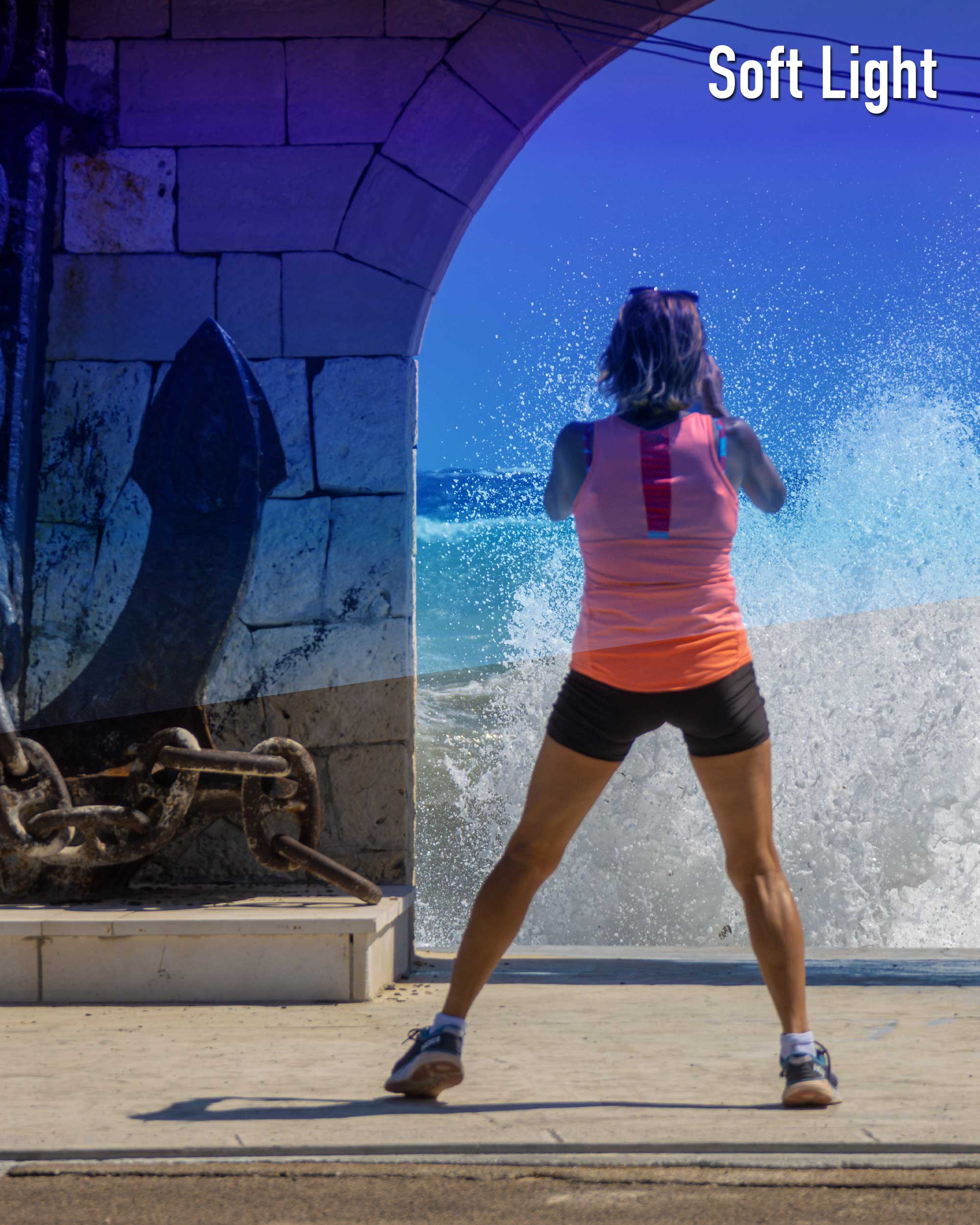
Soft Light and Hard Light are two more tools that can enhance your social media content. Soft Light subtly enhances your photos without harsh contrasts, while Hard Light adds a bit more intensity. Just remember, you can always adjust the Opacity slider if things get too intense.
Vivid Light: Intensity at its Best
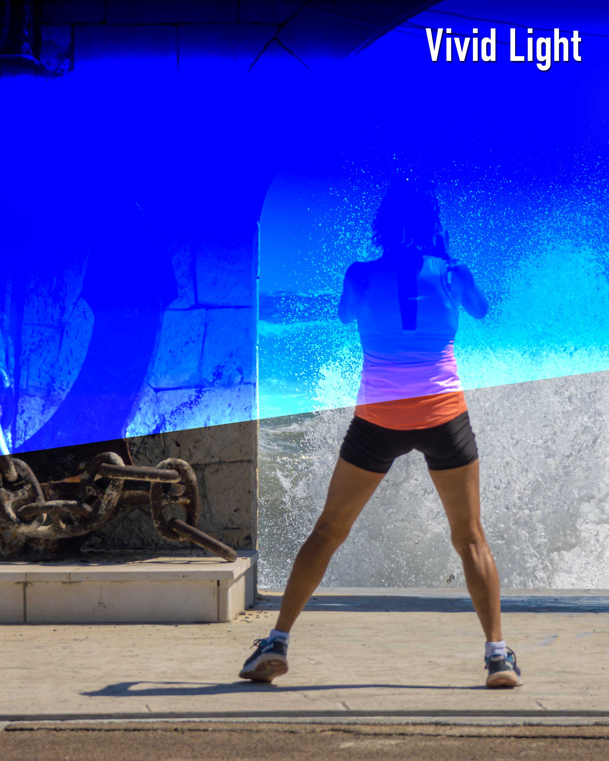
Lastly, I want to talk about Vivid Light, a blending mode that has taken my visuals to a whole new level of intensity. Paired with Linear Dodge in the Linear Light blending mode, you can achieve truly eye-catching effects. Trust me, your followers will thank you for it.
Exploring Other Blending Modes: The Untouched Territory
While we've covered a variety of blending modes, there's still a treasure trove of tools yet to be explored. Let's delve into these lesser-known blending modes and uncover their potential.
Difference and Exclusion: The Game Changers
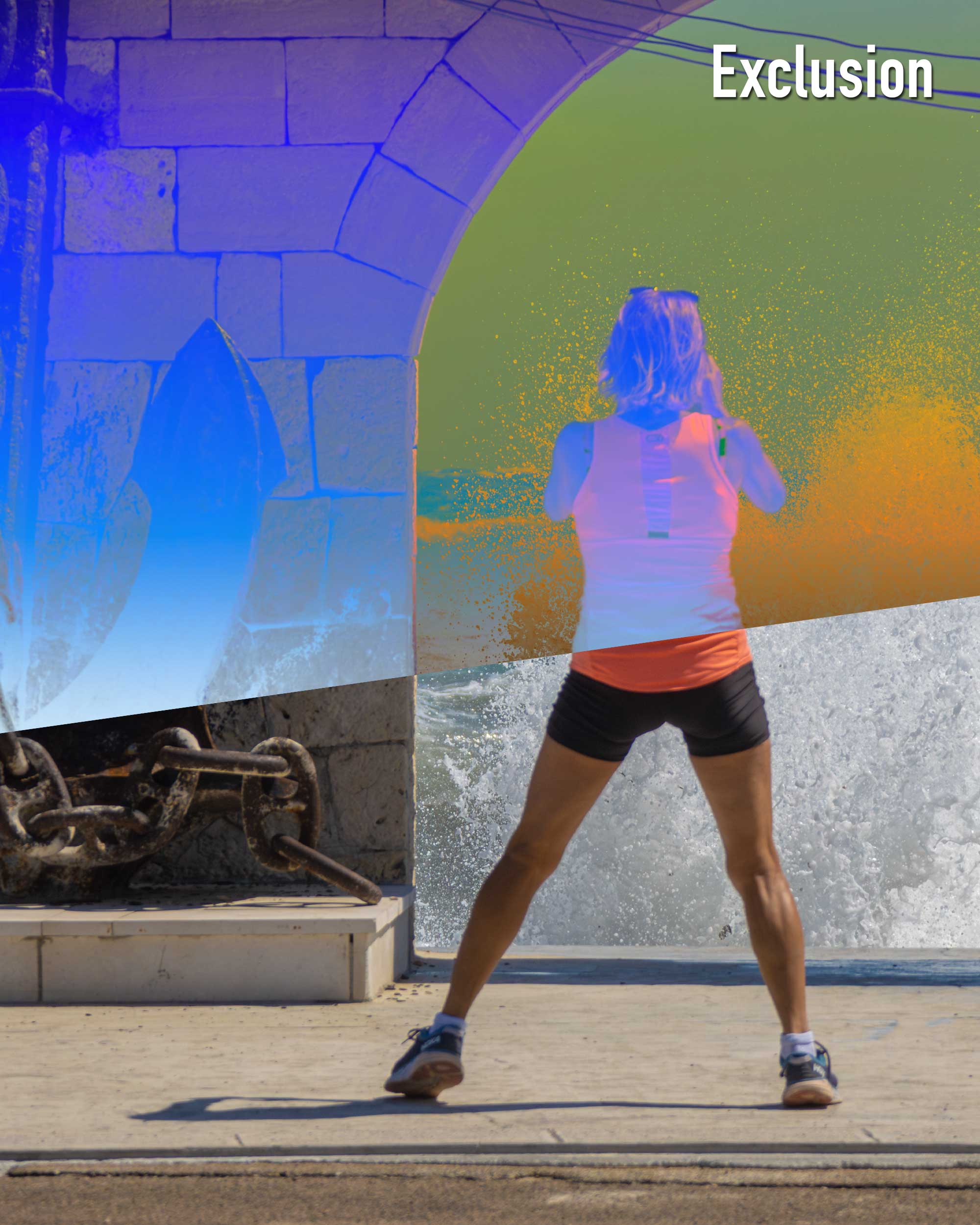
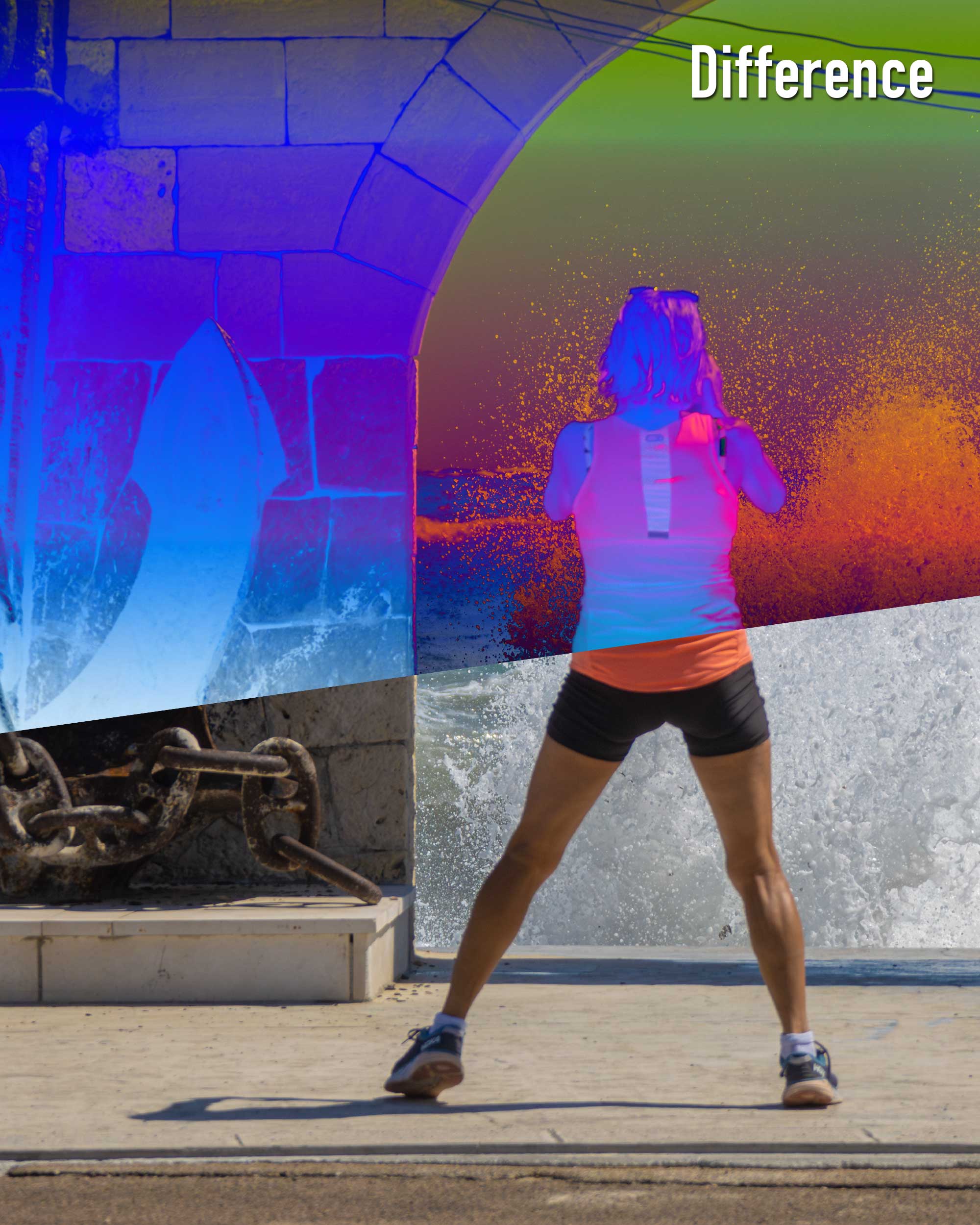
Difference and Exclusion blending modes might not always be your go-to choices, but their ability to create dramatic, sometimes psychedelic effects can be unexpected and impressive. Difference subtracts the lower colour values from the higher ones, resulting in a high-contrast, visually striking image. Meanwhile, Exclusion offers a softer version of the Difference mode, less contrasting but equally as captivating.
Subtract and Divide: The Mathematical Artists
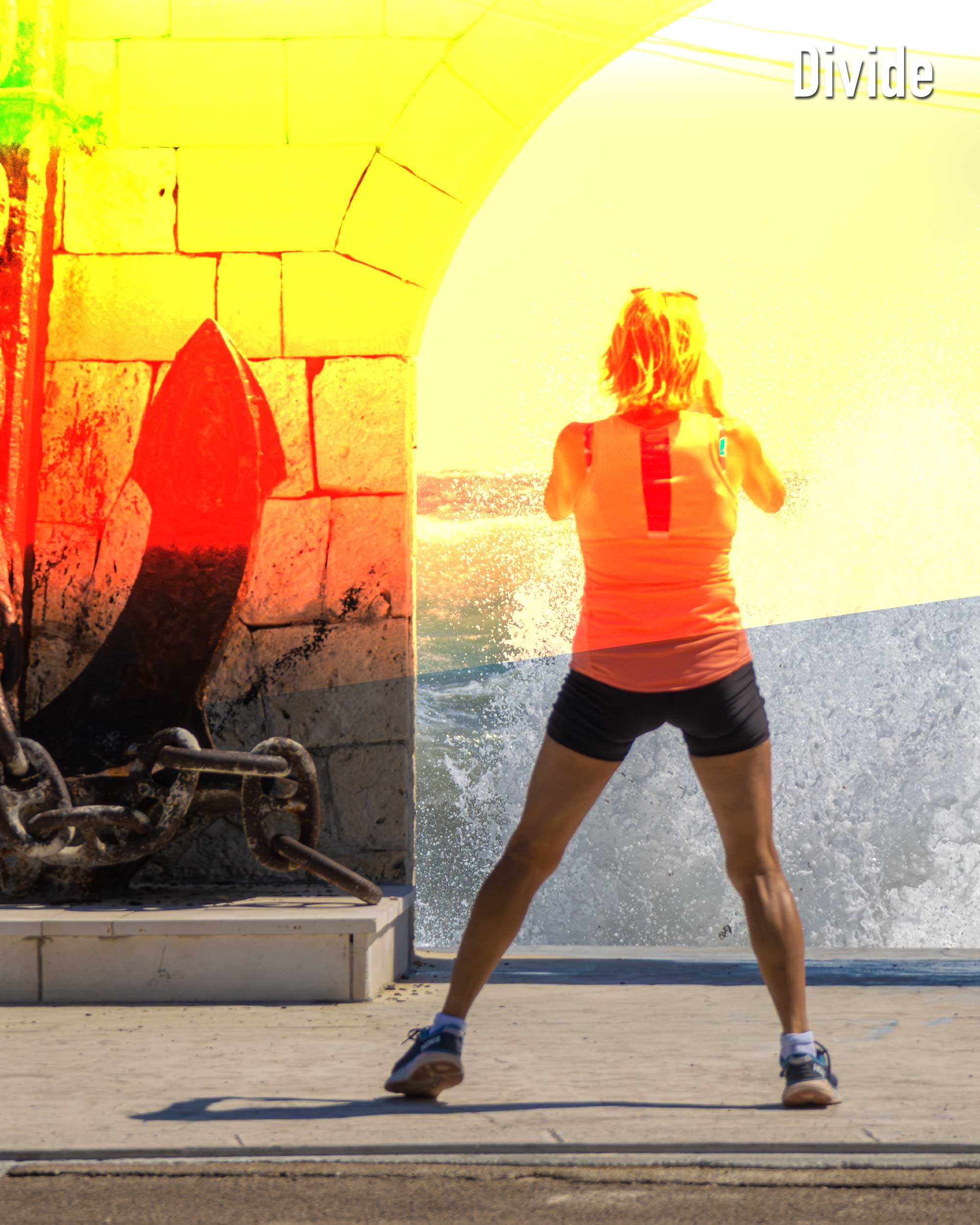
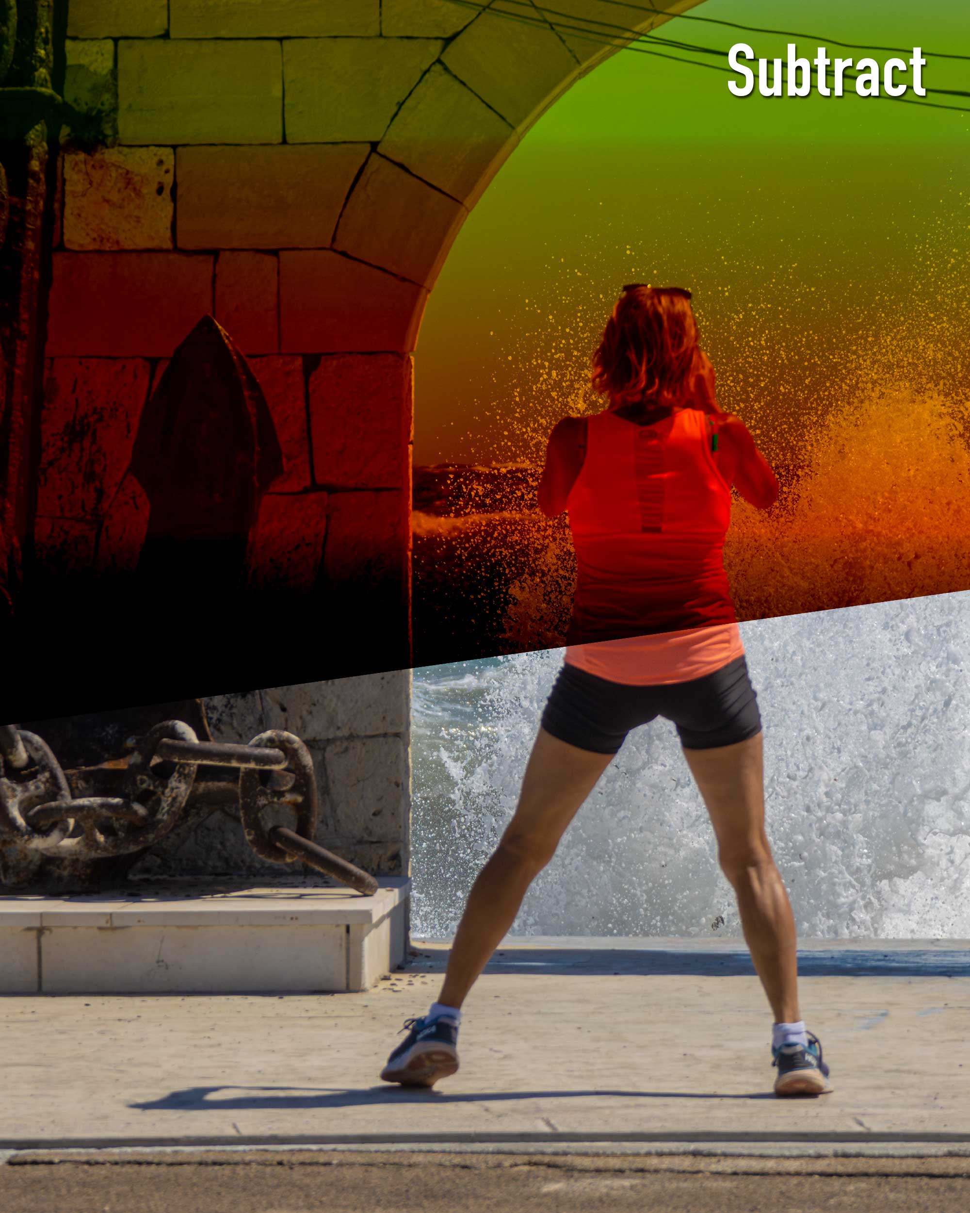
Subtract and Divide, as the names suggest, involve mathematical computations, but their function can produce more than just numbers. Subtract darkens the base colour by decreasing brightness, resulting in a dramatic and moody effect. On the other hand, Divide lightens the base colour, creating a washed-out, ethereal look. Both hold their own charm and can be wonderfully effective when used appropriately.
Subtract and Divide are blending modes that hinge on the principle of inversion, effectively flipping the traditional colour scheme and giving your designs an unexpected twist. Subtract, as the name implies, operates by subtracting the blend colour from the base colour. This results in darker tones and an overall decrease in brightness, thereby creating that signature moody ambiance. It's akin to adding a cosmic filter to your nighttime photography; it's all about deep, intense contrasts. On the other hand, Divide is essentially the opposite. It works by dividing the base colour by the blend colour, leading to a lighter, more ethereal outcome. Picture it as bathed in high-key lighting, almost dream-like.
The difference between the two primarily lies in the mood and visual aesthetic they create - Subtract veers towards the dramatic and intense, while Divide leans into the soft and celestial. As a professional graphic designer, I'd urge you to experiment with both modes and uncover their transformative power for yourself.
Darker Color and Hue: The Subtle Enhancers
Darker Color and Hue blend modes are subtle yet powerful tools in the design arsenal. Darker Color compares the total of all channel values for the blend and base colour and displays the lower value colour. Hue changes the hue of the base colour to the blend colour, while preserving the luminance and saturation of the base. These modes are great for achieving precise, finely tuned effects.

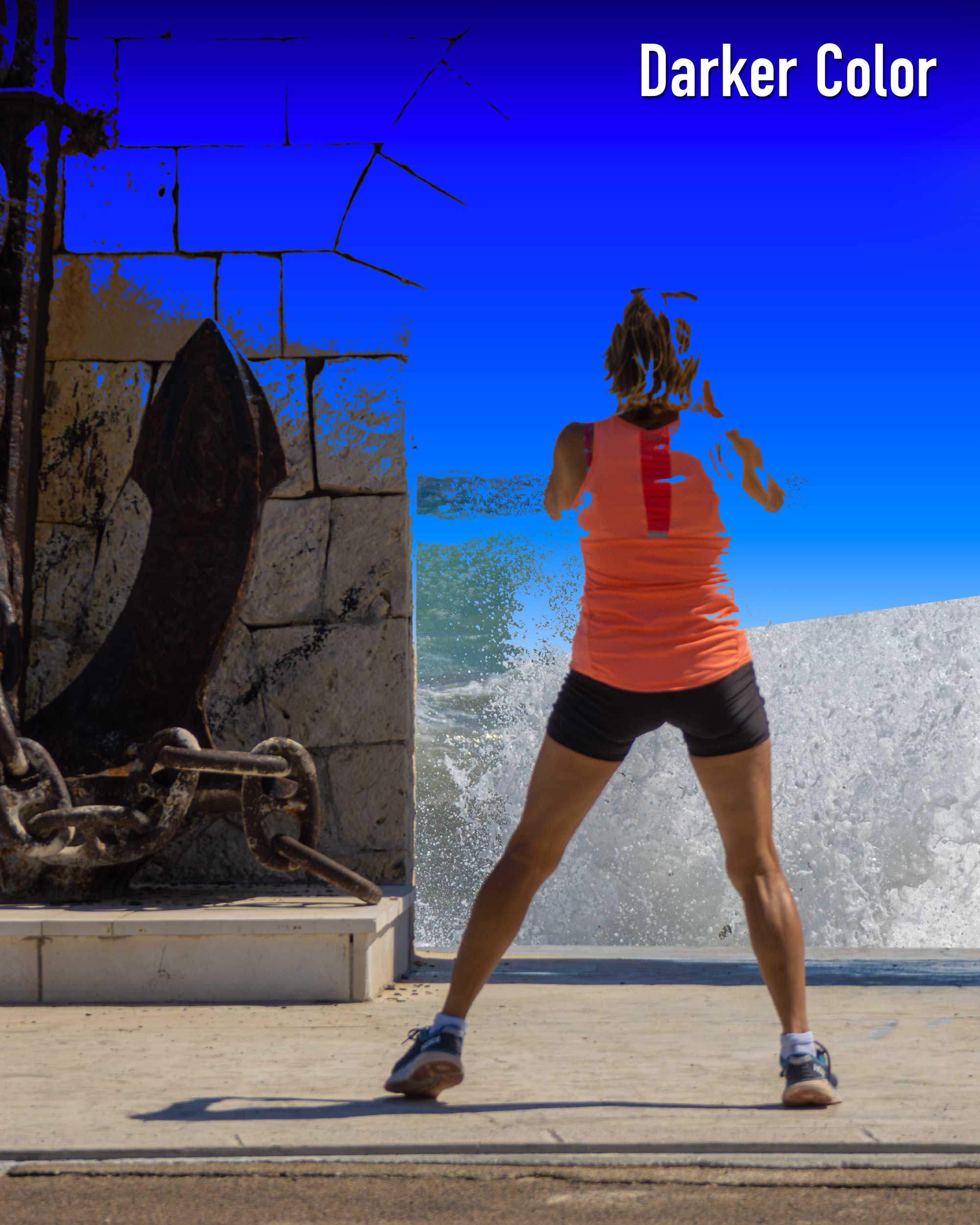
Blending modes are all about experimentation and discovery. So, don't be afraid to explore these less commonly used modes, and you might just stumble upon your new favourite design tool.
Delving Deep into Dark Blend Modes: Darken, Multiply, and Color Burn
Dark blend modes, namely Darken, Multiply, and Color Burn, wield a significant influence over the darker colours in your image. These modes can lend a profound, often dramatic, effect, although they primarily modify the lighter colours of the image.
Darken: The Light Suppresser
Darken mode works by comparing the blend and base colours and keeps the darkest of the two. It's akin to casting a shadow across your image, subduing the light colours while leaving the dark ones untouched. This can be especially useful when you want to overlay texture on images without affecting the darker areas or when you desire to add a darker, more solemn mood to your design.
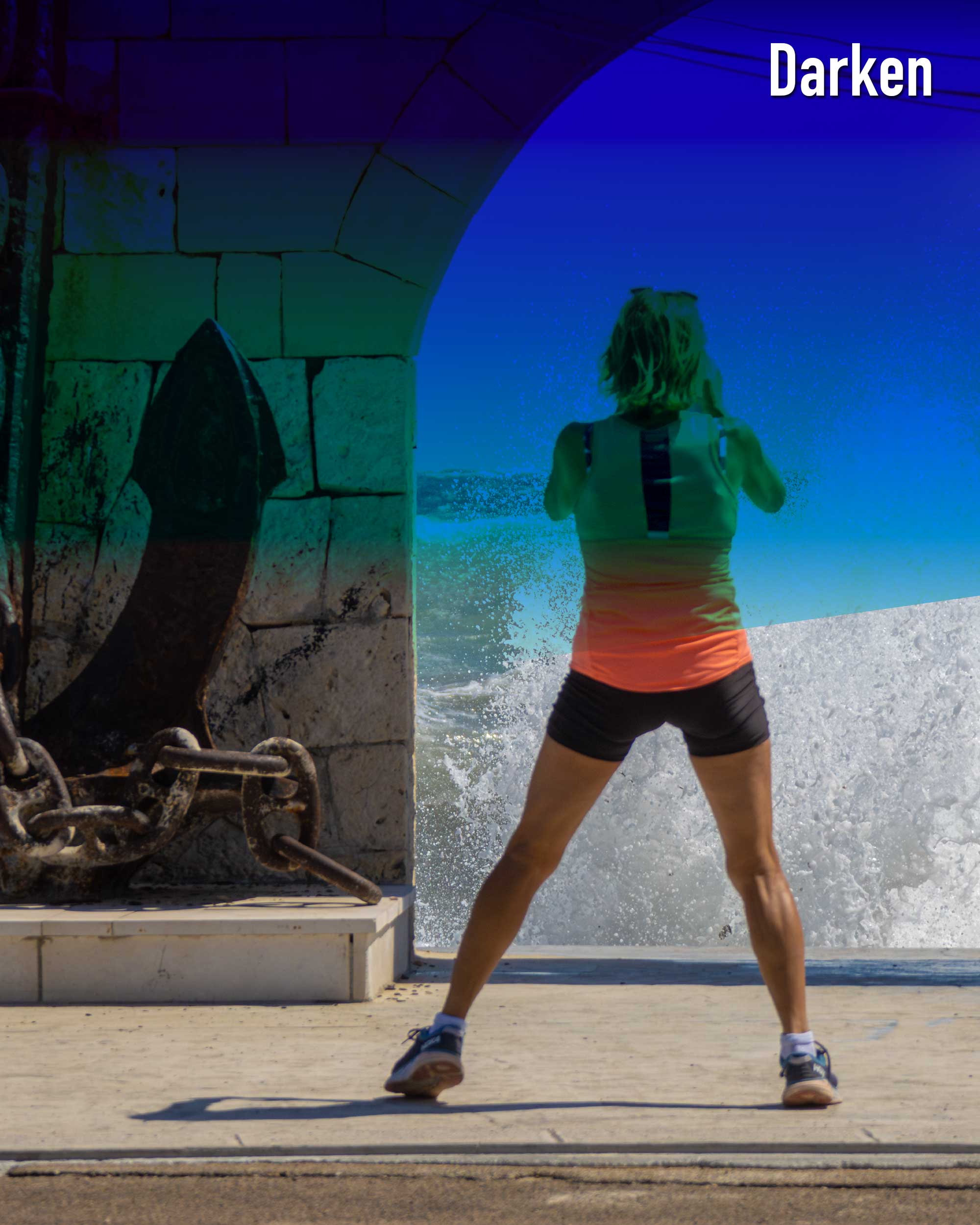
Multiply: The Depth Enhancer
Multiply, on the other hand, is like adding a semi-transparent dark veil over your image. It multiplies the base and blend colours, resulting in a darker, richer outcome. This intensifies the dark colours while minimising the brighter ones, effectively creating an effect similar to two slides projected together. Multiply can give your designs a deeper, more mysterious look and is perfect for creating shadow effects or darkening an image to bring a moody atmosphere.
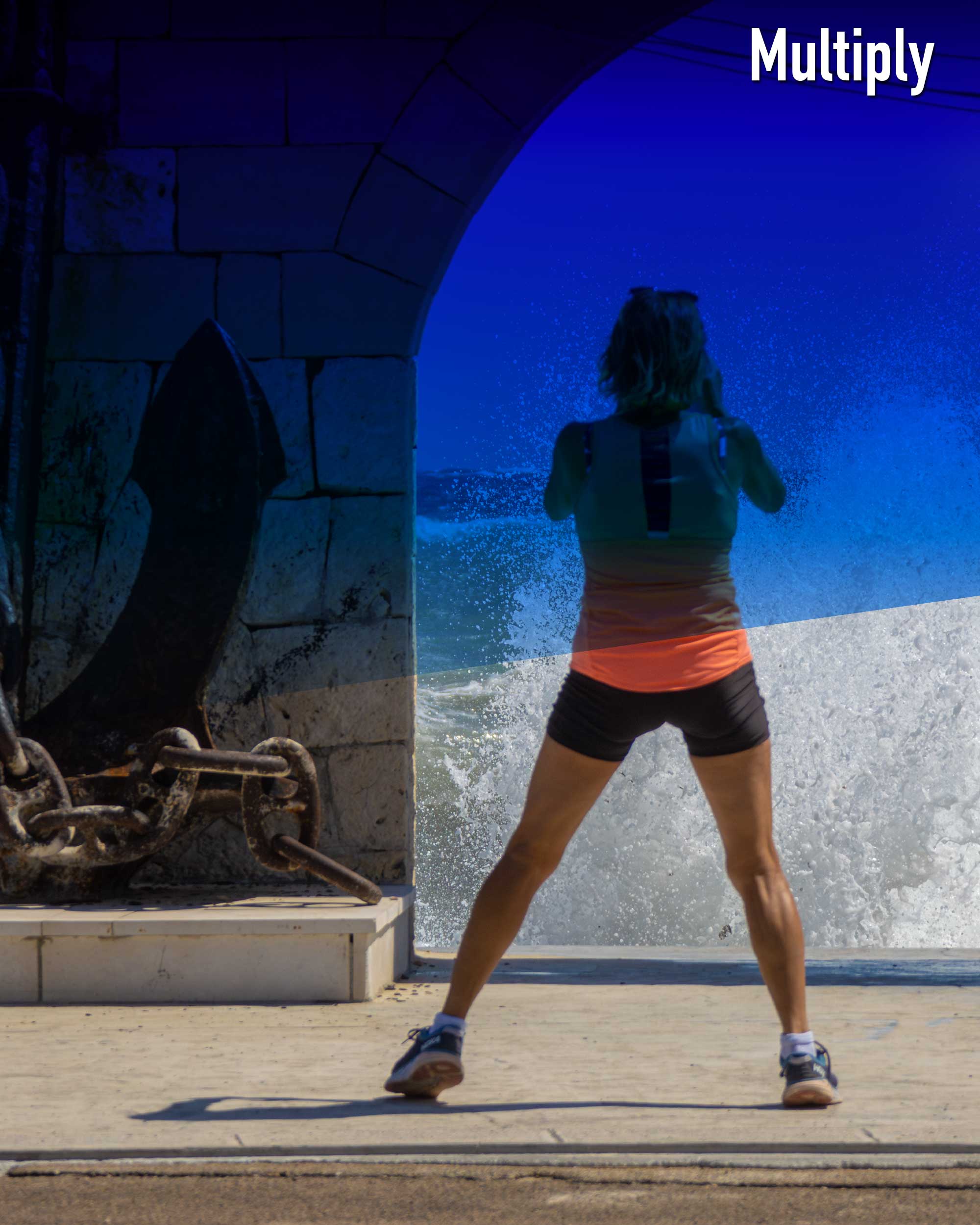
Color Burn: The Intensity Increaser
Color Burn intensifies the differences between the blend and base colours by increasing the contrast. Lighter colours are significantly darkened, often creating a burnt or toasted look, hence the name. It reduces brightness while enhancing saturation in the mid-tones, providing a dramatic, vivid effect. Ideal for bold designs, Color Burn can bring a punchy, high-contrast look to your images.
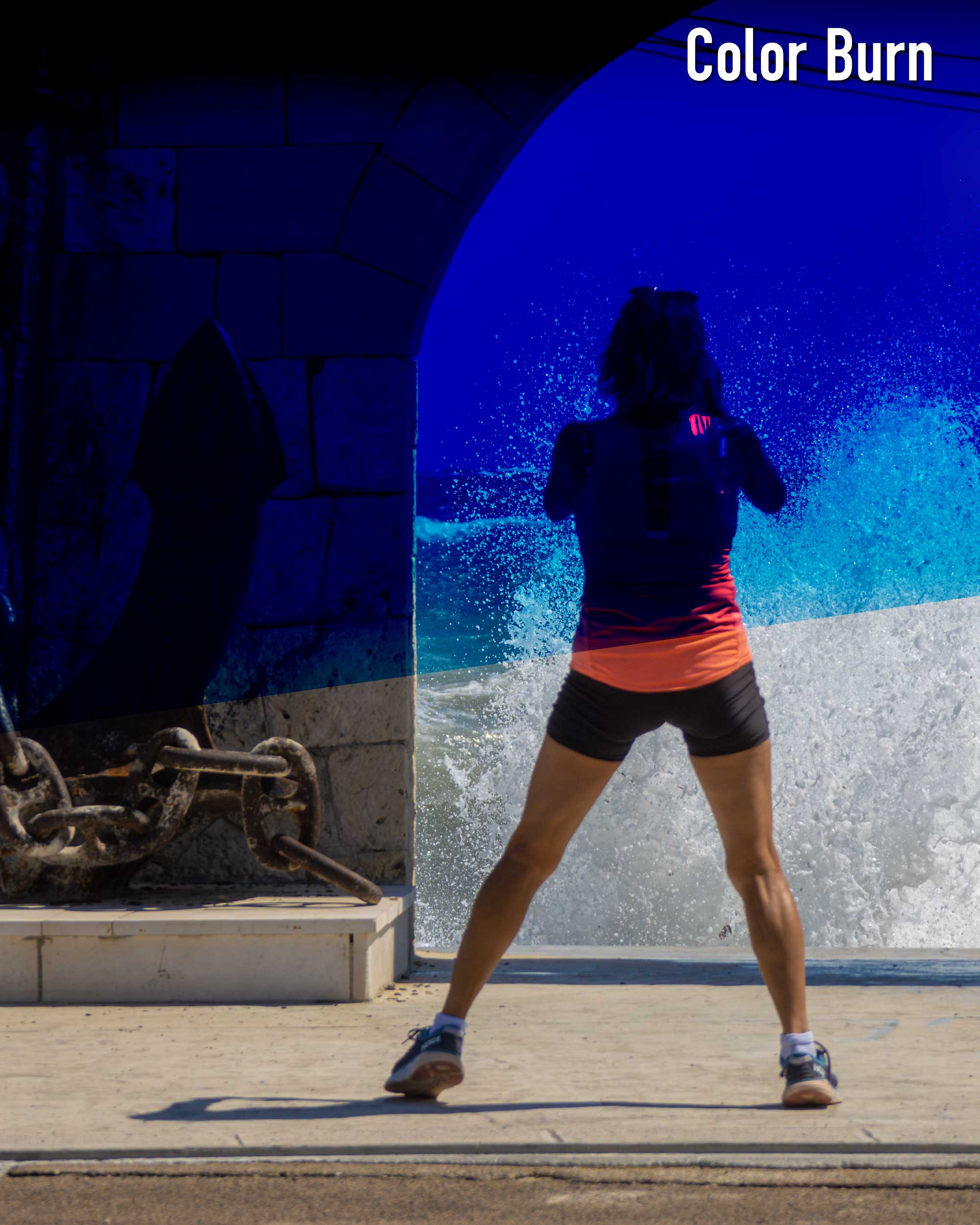
Conclusion
Blending modes are more than just a tool; they're a gateway to endless creativity. So, go ahead, experiment, play around, and see what works best for you. I'm always here to share my insights and experiences. So, let's embark on this creative journey together, and let's see where it takes us!

